I love to draw on black paper with white charcoal. I use only sight-size method of measuring, which fits how I see and comes to me naturally. This method has advantage over other drawing techniques such as comparative and relational measuring techniques, because it's easy to see values on the subject.
Most artists learn to draw by placing dark marks on white paper. For me, the opposite approach has always felt more natural. I prefer drawing with white chalk or white charcoal on black paper, allowing light to reveal the subject rather than using shadows to construct it.
I have always found the traditional method of drawing with graphite on white paper less intuitive. Over time, I switched almost entirely to white drawing media on black paper for my portrait and figure studies.
I discovered that I could work more efficiently by seeking and placing the "visual light" of the subject directly onto the paper. Rather than concentrating primarily on outlines, I focus on the qualities of the light source: its intensity, direction, angle, and the effects of reflected light on the human form.
This preference has influenced not only how I draw portraits but also how I approach oil painting.
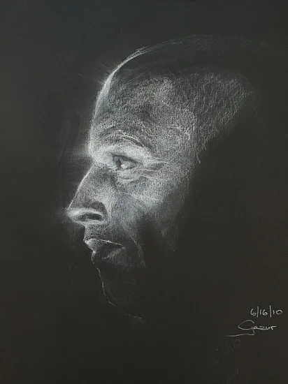
Drawing by Pavel Gazur
Drawing Light Instead of Drawing Shadows
The fundamental difference between drawing on white and black paper is where the artist begins on the tonal scale.
On white paper, the surface already represents the lightest value. The artist must introduce darker marks to build shadows, preserve highlights, and gradually establish the illusion of three-dimensional form.
On black paper, the process is reversed.
The paper already represents the deepest shadows. My task is to find the illuminated areas of the subject and gradually introduce lighter values using white chalk.
This makes the relationship between observation and drawing much more immediate.
When I see light striking a forehead, nose, cheekbone, or shoulder, I can place the white chalk directly where I observe that illumination. The figure gradually emerges from darkness.
I find this more natural than beginning with a white surface and having to darken everything surrounding an illuminated area.
I am not simply outlining the subject and filling in the shadows. I am using light to reveal its structure.
I took this same approach, for my oil painting techniques. I stain my canvas with burnet umber paint (Vasari Oil Colors or Winsor Newton) and never paint directly on the white canvas.
Here are few samples of my drawings from life models (about 3 hours) using this technique.

Drawing by Pavel Gazur
Building Toward the Light Versus Building Toward the Shadow
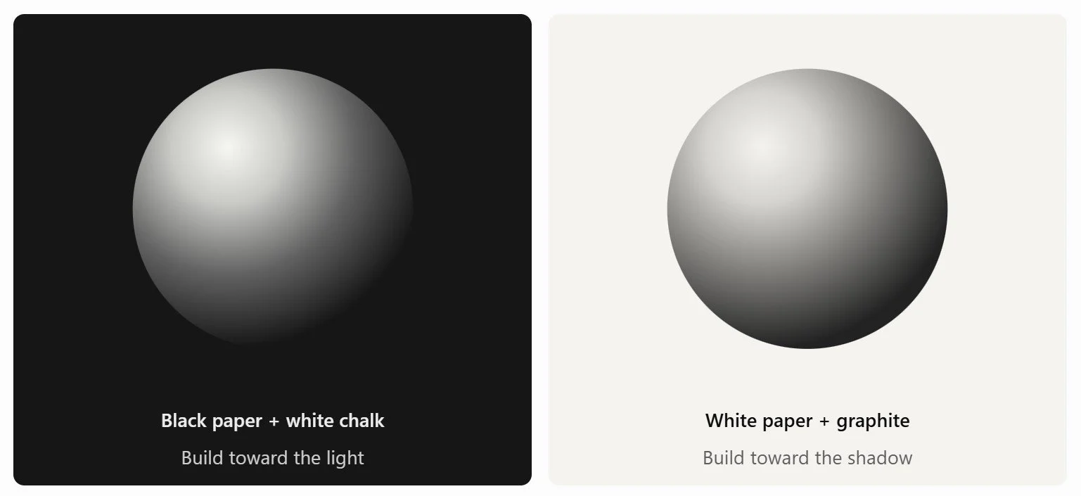
Black Paper vs White Paper
Two approaches to drawing the same three-dimensional form. On black paper, white marks build toward the light; on white paper, graphite builds toward the shadows. Both can produce the same tonal relationships, but the artistic process begins from opposite ends of the value scale.
This comparison illustrates why one approach might feel more intuitive than another.
With graphite on white paper, the brightest highlights often remain untouched. With white chalk on black paper, I actively construct those highlights.
Neither approach is inherently more accurate. Both require careful observation of value relationships. However, the direction in which those values are developed can make a considerable difference to an artist's working process.
Why Some Artists Find Black Paper Easier
One of the most interesting things I have learned is that artists do not all approach visual observation in the same way.
Some artists naturally concentrate on outlines, proportions, and recognizable shapes. Others may pay greater attention to large patterns of light and dark, tonal transitions, and the way illumination reveals three-dimensional form.
I tend to approach drawing through light.
When looking at a face, I am particularly interested in where light strikes the surface, how it changes direction across the different planes, and where the form gradually disappears into shadow.
It is possible that my preference for black paper reflects this way of organizing visual information.
I wouldn't suggest that this represents a special type of eyesight or a fundamentally different brain. Rather, it may be a difference in artistic attention and the way visual information is translated into drawing.
For someone who naturally concentrates on light, white chalk on black paper may reduce the mental effort required to translate what they observe into marks.
Instead of thinking about how much darkness must be added around a highlight, the artist can place the highlight itself.
For me, this makes drawing feel more fun, just simply seeking what light is doing and arranging that light into something beautiful.
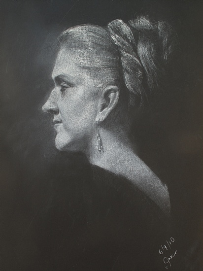
Drawing by Pavel Gazur
Understanding Values: The Foundation of Realistic Drawing
Regardless of whether an artist works on black, white, or toned paper, understanding values is essential.
Value refers to the relative lightness or darkness of an area, independent of its color.
When studying a portrait, I try to recognize the major tonal relationships before concentrating on individual features.
For practical purposes, I divide the subject into five broad value groups:
Deep shadows — Areas receiving little or no direct light.
Dark halftones — Transitional areas on the form approaching the shadow.
Middle values — Values between the brightest and darkest areas.
Light halftones — Illuminated planes that are not the brightest parts of the subject.
Highlights — The brightest areas where illumination or specular reflection is strongest.
On black paper, I begin with the shadows already established by the surface. I then introduce lighter values through the pressure, density, and layering of white chalk.
One of the most common mistakes artists make with this technique is using too much white too early.
If every illuminated area is drawn with maximum intensity, the drawing loses its tonal hierarchy. Without subtle differences between the light halftones and the brightest highlights, the form can appear flat.
The brightest whites should be used selectively.
This creates a visual hierarchy in which the viewer's attention is naturally attracted to the strongest areas of illumination.

Drawing by Pavel Gazur
How Light Reveals the Human Form
A face is not simply a collection of features. It is a complex three-dimensional structure made up of planes and curved surfaces.
Consider a portrait illuminated from above and slightly to one side.
The forehead catches a broad area of light. The bridge of the nose produces a narrower illuminated plane. One cheekbone may be strongly lit, while the opposite side of the face turns into shadow.
These relationships describe the structure of the head.
When I draw, I try to observe these illuminated planes as larger shapes rather than immediately treating the eyes, nose, and mouth as separate objects.
This allows me to establish the overall form before becoming distracted by details.
Hard, Soft, and Lost Edges
Edges are just as important as tonal values in creating a convincing drawing.
A hard edge is a distinct transition between two areas. A soft edge is a gradual transition, often found where a rounded surface turns away from the light.
A lost edge occurs when the value of a form becomes similar to its surroundings, making the boundary difficult to distinguish.
Black paper is particularly effective for creating lost edges.
The dark side of a face, neck, or shoulder can merge into the paper itself. Rather than drawing every contour, I can allow portions of the form to disappear.
The viewer's eye completes the missing information.
This is one of the qualities I enjoy most about working with black paper. The drawing does not need to describe every part of the subject equally.
Sometimes the areas left untouched are just as important as the marks I make.

Drawing by Pavel Gazur
The Importance of Reflected Light
In addition to direct illumination, I pay close attention to reflected light.
Light that strikes a nearby surface can bounce back into areas that would otherwise remain in shadow.
In portrait drawing, reflected light may appear along the underside of the chin, the shadowed side of the cheek, or the curves of the neck and shoulders.
These subtle changes in value can help describe the shape of the human figure.
However, reflected light should generally remain less intense than the main illuminated areas if the drawing is to maintain a consistent light source.
When working on black paper, I use delicate amounts of white chalk to suggest these secondary illuminations.
The result can be a more convincing transition between light and darkness.
An artist who learns to distinguish direct light, halftones, reflected light, and cast shadows gains a much stronger understanding of how illumination creates form.

Drawing by Pavel Gazur
Why I Prefer the Sight-Size Drawing Method
Another important part of my process is the sight-size method of measuring.
I use this technique because it fits the way I observe the subject and comes naturally to me.
In sight-size drawing, the artist works from a consistent observation position, arranging the subject and drawing so they can be compared at the same apparent scale.
This allows direct visual comparisons between the subject and the marks on the paper.
For example, I can compare the apparent width of the head, the angle of the shoulders, or the position of the nose with the corresponding relationships in my drawing.
Rather than relying entirely on proportional calculations, I continually compare what I have drawn with what I see.
This doesn't eliminate the need to understand anatomy or perspective, and it is not necessarily superior to comparative measuring in every situation.
However, for my approach, the combination of sight-size observation and drawing light on black paper feels particularly natural.
The sight-size method helps me establish accurate proportions, while the white chalk allows me to concentrate on the illuminated planes of the subject.
My Approach to a Three-Hour Life Drawing
Most of the drawings shown here were made from live models during sessions lasting approximately three hours.
Working from life forces the artist to make decisions about what matters most.
There isn't enough time to describe every detail. The most important challenge is to establish the overall structure and tonal relationships.
My approach can be broken down into six stages.
1. Study the Light Source
Before beginning, I observe where the strongest light falls, where the shadows begin, and how the light describes the major planes of the face or figure.
2. Establish the Overall Proportions
Using sight-size comparisons, I place the subject on the paper and establish the major dimensions and relationships.
3. Draw the Largest Light Shapes
I begin introducing the broad illuminated areas rather than concentrating on small details.
At this point, the drawing should already suggest the overall form when viewed from a distance.
4. Develop the Halftones
I gradually introduce intermediate values, allowing the planes to turn toward and away from the light.
This stage is especially important for creating a sense of volume.
5. Refine the Edges
I evaluate which transitions should be sharp, which should be soft, and which can disappear into the background.
6. Strengthen the Highlights
Finally, I emphasize the brightest areas while preserving the relationships established in the earlier stages.
The goal is not to make every part of the drawing equally detailed. It is to establish a convincing impression of the model through accurate proportions, values, and light.
Two Drawing Books I Love: Greuze and Vanderpoel
Two books that I particularly appreciate are Greuze the Draftsman by Edgar Munhall and The Human Figure by John H. Vanderpoel.
Although they approach drawing from different perspectives, I believe both offer valuable lessons for artists interested in the human form.
Greuze the Draftsman — Edgar Munhall
Greuze the Draftsman — The Frick Collection
Jean-Baptiste Greuze (1725–1805) was an eighteenth-century French painter and draftsman known for his expressive portraits, figure studies, and emotionally engaging subjects.
Edgar Munhall's Greuze the Draftsman explores his remarkable work on paper. Published in connection with an exhibition at the Frick Collection and the J. Paul Getty Museum in 2002, the book offers an opportunity to study Greuze's approach to drawing the human figure.
What interests me particularly about the tradition represented by Greuze is the relationship between careful observation, tonal modeling, and the expressive possibilities of drawing.
For artists working with black paper and white chalk, these historical figure studies are worth examining for their treatment of form, subtle value changes, and the relationship between light and shadow.
Even when the medium or paper differs, the underlying challenge remains the same: how to make a two-dimensional drawing feel convincingly three-dimensional.
The Human Figure — John H. Vanderpoel
The Human Figure — John H. Vanderpoel
John H. Vanderpoel's The Human Figure, originally published in 1907, is one of the classic books on figure drawing and understanding the structure of the human body.
The book contains hundreds of drawings examining the head, facial features, torso, arms, hands, legs, and other parts of the body.
What makes this book valuable is the way it encourages artists to look beyond recognizable features and understand their underlying structure.
A convincing portrait requires more than knowing where the eyes, nose, and mouth belong. The artist must understand how those features relate to the larger planes of the head.
That understanding becomes especially important when working with light.
If you understand the structure of a cheekbone, for example, it becomes easier to recognize why one plane receives light while another turns into shadow.
For anyone interested in improving portrait or figure drawing, I consider Vanderpoel an excellent book to study alongside regular drawing from life.
What These Books Teach Us
Greuze's drawings offer the opportunity to study the expressive and artistic possibilities of observing the human figure.
Vanderpoel provides a more systematic approach to understanding form, proportion, and anatomical relationships.
Both can improve the artist's ability to see.
For me, that remains the foundation of good drawing: learning to recognize not only what an object is, but how its structure appears under light.
Try This Exercise: Draw the Same Subject on Black and White Paper
If you have never tried drawing with white chalk on black paper, I encourage you to experiment.
Choose a simple object or a portrait photograph illuminated by one directional light source.
Create two drawings of the same subject.
First drawing: Graphite on white paper
Begin with the white surface and build the shadow values using graphite. Preserve the areas receiving the brightest light.
Second drawing: White chalk on black paper
Begin with the black surface and introduce the areas receiving light. Allow the paper to represent the darkest shadows.
Spend approximately 20–30 minutes on each drawing.
When finished, compare the experience.
Which approach made it easier to observe three-dimensional form? Which allowed you to recognize tonal relationships more naturally? Did you find yourself concentrating more on the outlines or on the way light revealed the structure?
There is no universally correct answer.
The exercise is about discovering which method allows you to translate what you see onto paper most naturally.
For me, white chalk on black paper has consistently been the easier and more intuitive approach.
From Black Paper to Oil Painting: Why I Tone My Canvas with Burnt Umber
My preference for black paper also influenced the way I approach oil painting.
I never begin a painting directly on a white canvas, ever!
Instead, I first tone the canvas with burnt umber, using oil paints such as Vasari or Winsor & Newton.
This creates a warm, darker foundation upon which I can develop the composition, by simply wiping out areas where is see “light”. In less than 3 minutes I can see my composition.
Although a burnt umber ground is not as dark as black paper, the principle is similar.
I prefer to establish a tonal foundation and then gradually build the lighter areas of the painting.
A toned canvas also allows me to evaluate the relationships between light and shadow without the distracting brightness of the original white surface.
For me, this feels like a natural extension of drawing with white chalk.
From Portraits to California Coastal Landscapes
At first glance, a portrait and a coastal landscape might seem like completely different subjects.
However, both depend on an understanding of how light describes three-dimensional forms. I didn’t understand this at first at my art school and I was questioning why I had to learn drawing, instead of painting seascapes.
The illuminated plane of a cheekbone is not fundamentally different from the illuminated face of a coastal cliff.
Both change in value as their surfaces turn toward or away from the light.
Similarly, the lost edge of a shoulder disappearing into darkness shares a visual principle with a distant coastline fading into atmospheric haze.
When painting the California coast, particularly Big Sur, I am interested in the relationship between light, shadow, atmosphere, and the natural shapes of the landscape.
The subject has changed from the human figure to cliffs, ocean, and sky, but many of the observational skills remain the same.
Explore my California coastal oil paintings, including my work inspired by Big Sur and the Pacific coastline.
Final Thoughts: Learning to See Light
Working with white chalk on black paper taught me that drawing doesn't have to begin with an outline.
For me, the process begins by observing where light strikes the subject and how the illuminated areas reveal its underlying structure.
I prefer to build form through light rather than construct it primarily through darkness.
This approach influences the way I draw portraits, study the human figure, and paint coastal landscapes.
The most important lesson I would offer other artists is to experiment with different ways of seeing and working.
Try drawing with light rather than shadow. Study the large tonal relationships before concentrating on details. Learn to recognize the planes of the human form and how those planes respond to illumination.
And perhaps most importantly, remember that a drawing doesn't need to describe everything.
Sometimes what you leave in darkness is just as important as what you reveal with light.
For me, drawing is not simply the process of representing an object. It is the process of revealing that object through light.
Further Reading and Resources for Artists
For artists interested in learning more about traditional drawing methods, light and shadow, and the history of figure drawing, I recommend these resources.
Museum Resources
The Metropolitan Museum of Art — Chalk
An overview of the historical use of red, black, and white chalk, including drawing on toned paper and the technique of heightening.National Portrait Gallery — Drawing Techniques and Materials
Educational guidance on drawing materials and techniques, useful for exploring different ways to approach portraiture.Clark Art Institute — Lines from Life: French Drawings from the Diamond Collection
A valuable discussion of traditional drawing techniques, including hatching, stumping, and heightening with white.
Books I Recommend
Greuze the Draftsman — Edgar Munhall
A study of the remarkable drawings of eighteenth-century French artist Jean-Baptiste Greuze.The Human Figure — John H. Vanderpoel
A classic instructional book on figure drawing, anatomy, proportion, and understanding the underlying structure of the human body.
More of My Work
Explore my original California coastal paintings, where I continue to apply many of the same principles of light, shadow, and three-dimensional form developed through figure drawing.
All drawings shown in this article are original artwork by Pavel Gazur.